-Pulse-
UX/UI
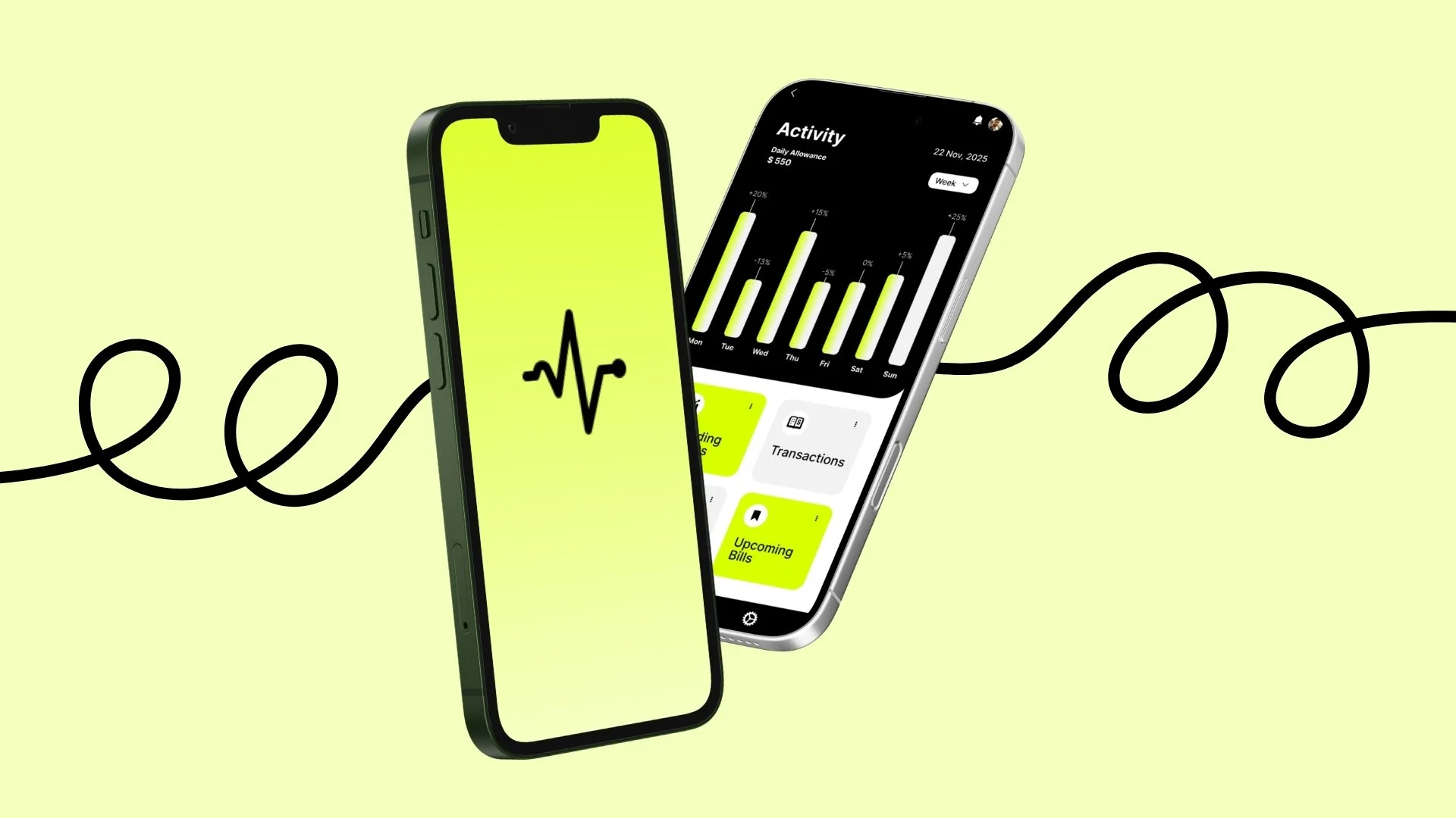
-Pulse- UX/UI
Pulse is a mobile budgeting app designed to help students, newcomers, and young adults manage money with more clarity and less stress. Built through UX research, persona development, task flows, and usability testing, the project responds to a common problem: most financial tools feel overly complex, fragmented, or disconnected from the realities of early adulthood.
Product Strategy . UX Research . Information Architecture . Interaction Design . UX/UI Design . Visual Design . UX Writing
Problem Statement
Students and young adults often struggle to manage their finances because existing tools are either too complicated, too fragmented, or not built around their everyday needs. Many rely on multiple apps, manual tracking, or inconsistent habits, which makes budgeting harder to maintain over time. Pulse addresses this by creating a more intuitive and supportive budgeting experience.
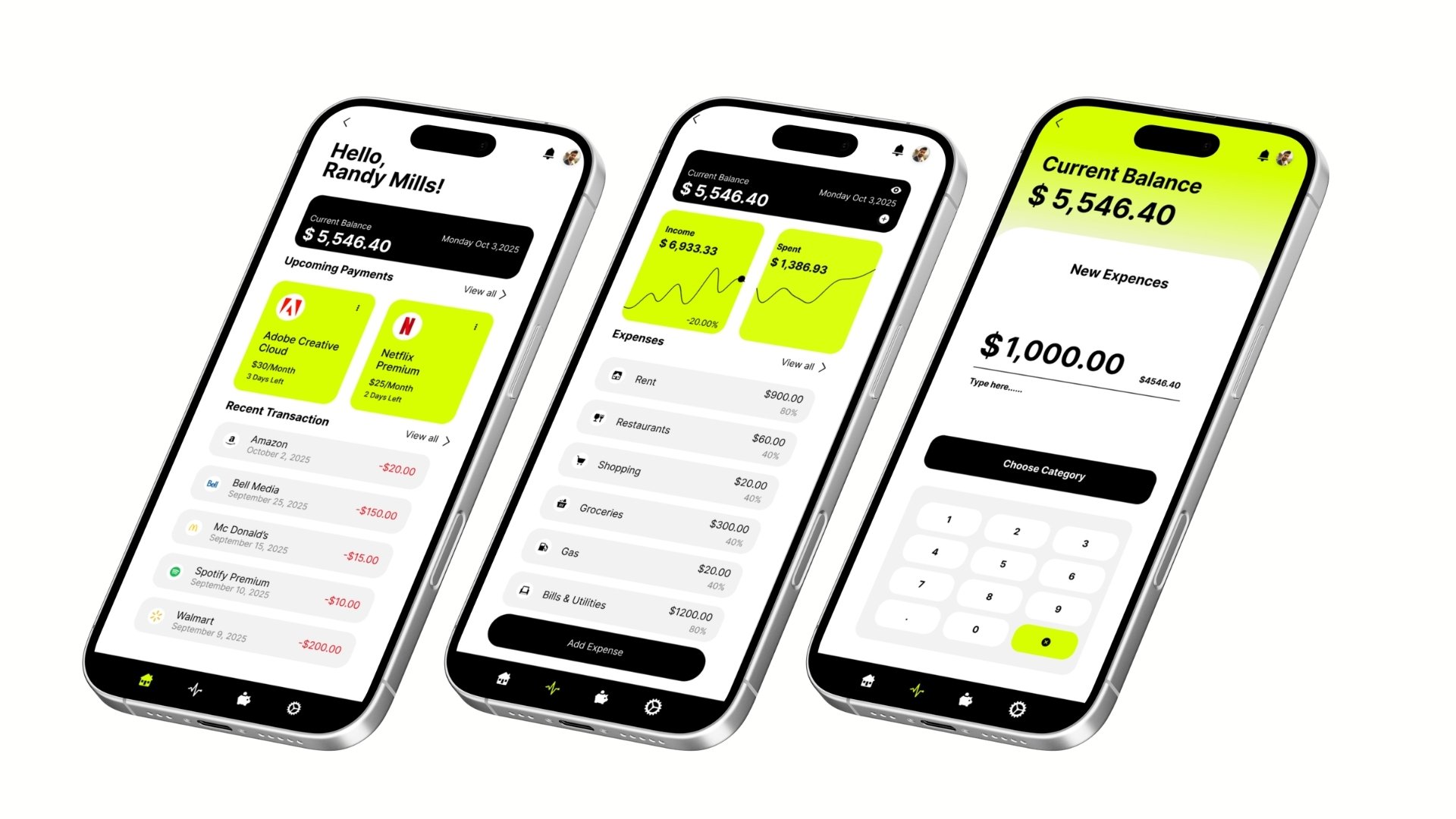
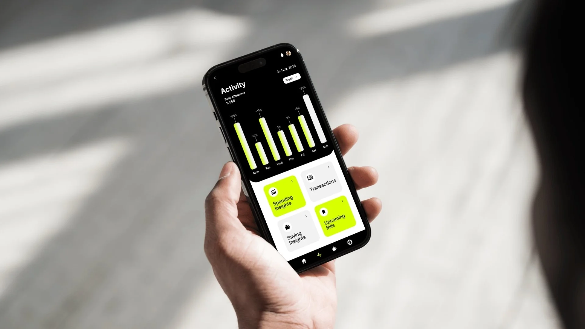
This screen was designed to make financial habits feel instantly readable and actionable. By combining a weekly activity chart with quick-access insight cards, the interface helps users understand spending patterns, review transactions, and stay aware of upcoming bills at a glance. The high-contrast black-and-white base is paired with a bright accent colour to direct attention toward key actions and important data, creating a visual system that feels both modern and motivating. The result is a dashboard that turns financial tracking into a clearer, less overwhelming daily experience.
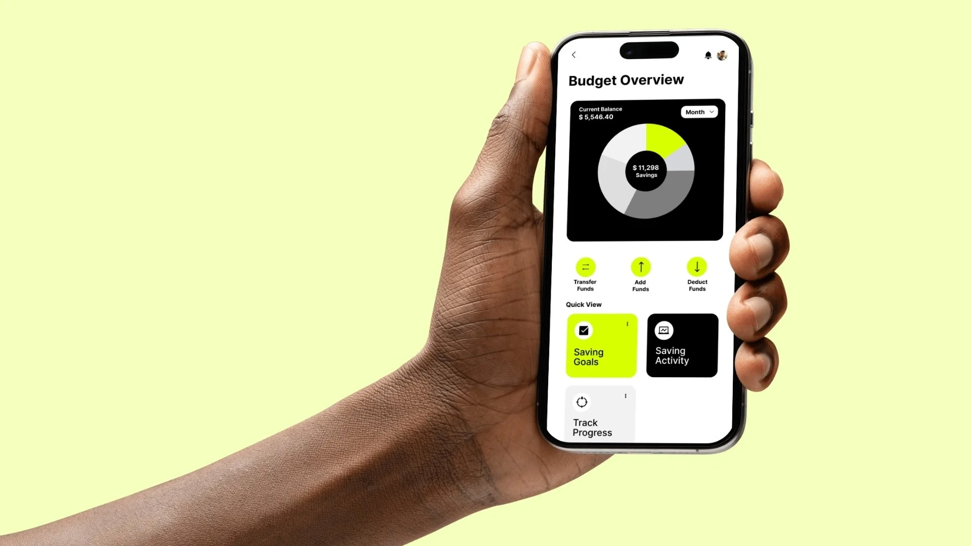
Budget Overview presents a clear snapshot of the user’s financial position in one glance. A central savings visualization turns financial data into an easy-to-read focal point, while quick actions like transferring, adding, or deducting funds support fast daily interaction. Supporting modules such as Saving Goals, Saving Activity, and Track Progress extend the experience beyond simple monitoring, encouraging active financial management and long-term habit building. The high-contrast palette and bright accent colour establish strong hierarchy, draw attention to key actions, and keep the interface feeling modern, clean, and approachable.